VPN Service

E-com App Redesign
Trading App
Investment Dashboard


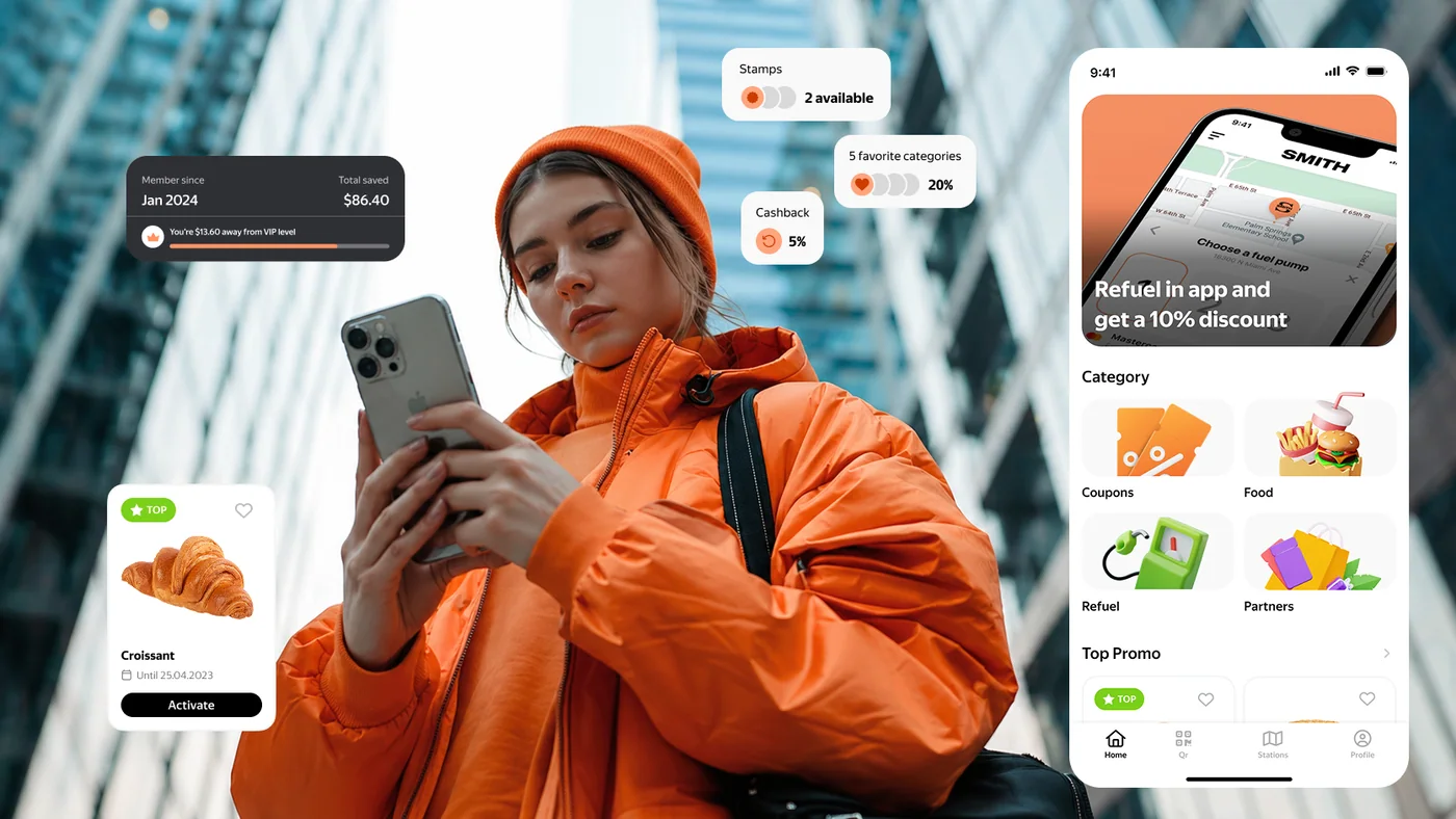
When I joined the project, the product was already live and actively used by various e-commerce clients. It was a customizable platform that allowed businesses to build their own app by combining different features — coupons, loyalty programs, fuel services, car wash, promotions, and more.
From a business perspective, everything seemed solid: the product was flexible, feature-rich, and could be adapted to different needs.
However, the situation was quite different from a user experience standpoint.
The issue became clear through user behavior:
At the same time, the interface already included core and even valuable features — but they didn't work together as a cohesive product.
As I started digging deeper, it became clear that the problem wasn't the lack of functionality.
The real issue was how that functionality was presented.
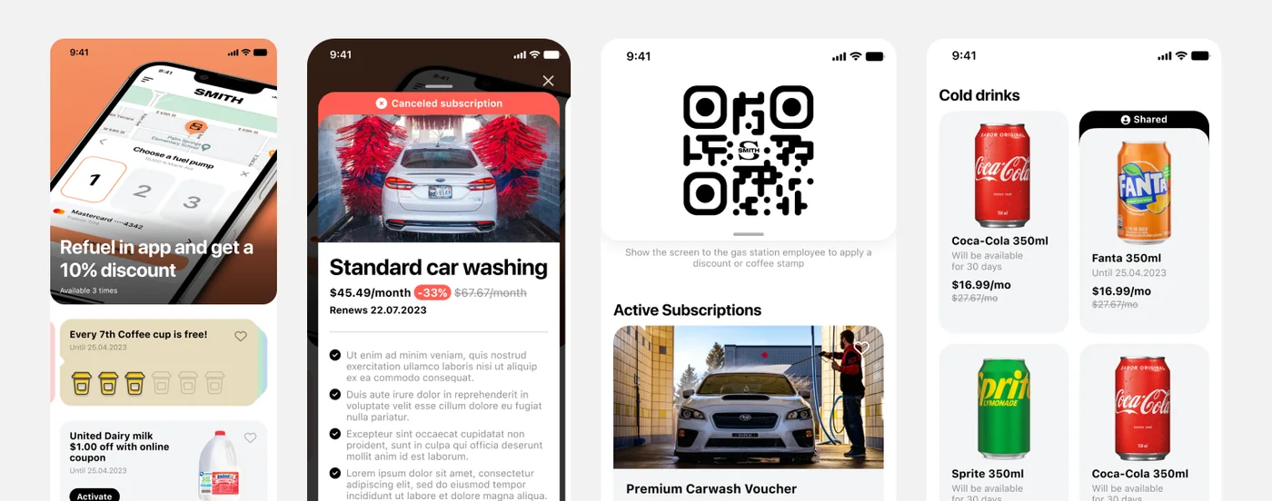
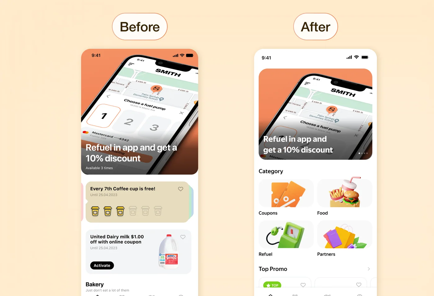
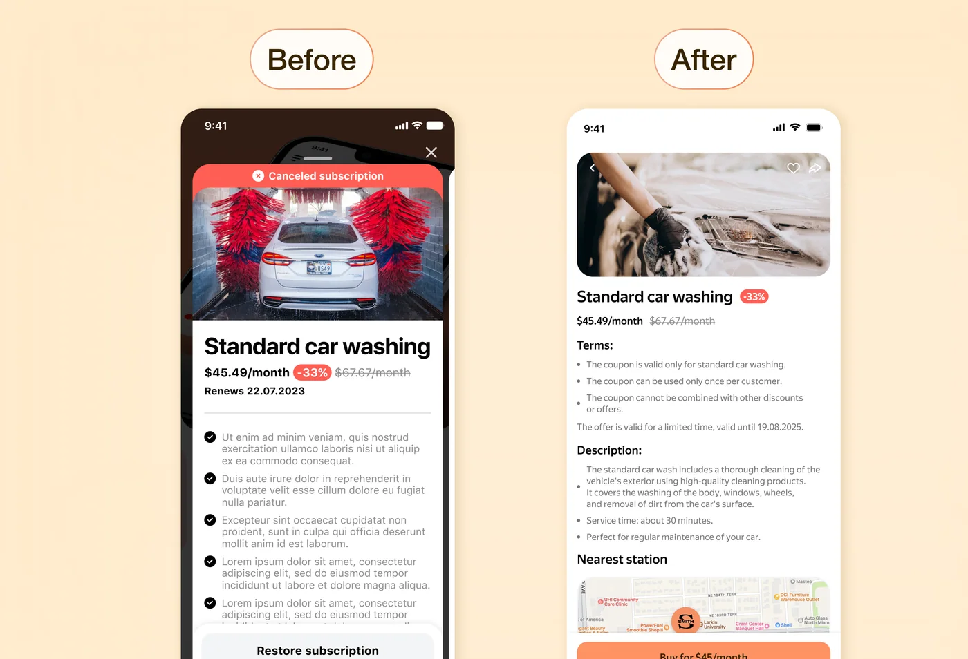
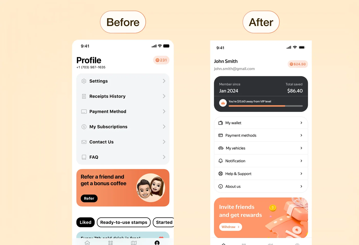
App Before Redesign
The interface felt fragmented:
As a result, users had options — but no clear starting point or reason to return.
My task wasn't just to redesign the interface, but to:
make the product's value immediately clear and help users start key actions effortlessly
while preserving existing user habits and avoiding disruptive changes.
I started with a simple question:
which scenarios actually matter and should happen regularly in the product?
To answer this, I conducted a UX audit — reviewing existing flows, interface structure, and user interactions to identify where users were dropping off or getting confused.
This helped pinpoint key issues in hierarchy, navigation, and feature discoverability.
From there, the work focused on three main areas:
What changed
What changed
What changed
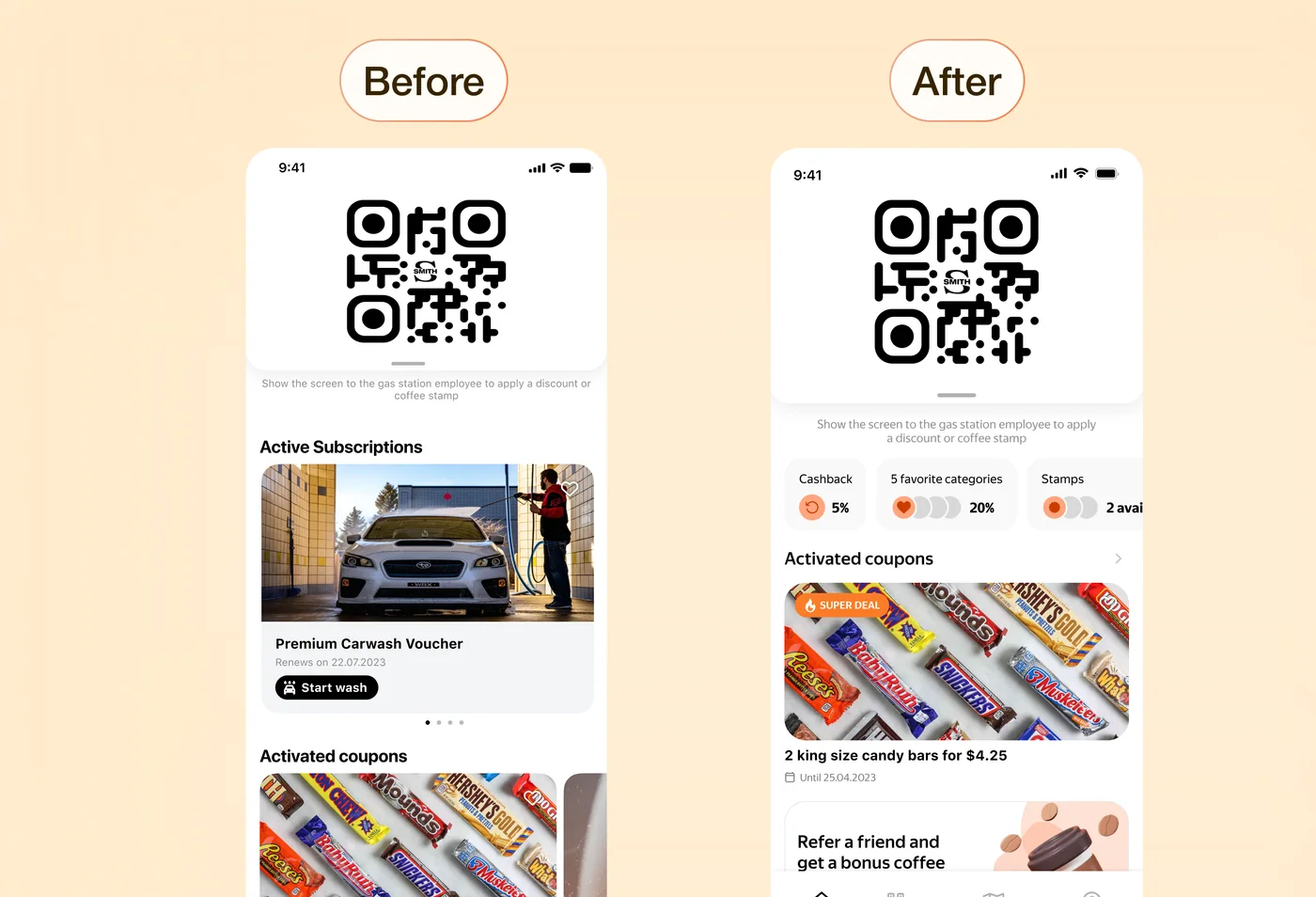
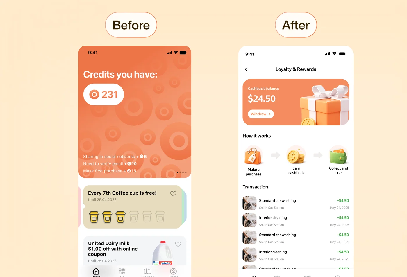
Before, the reward system existed but wasn't clear or motivating. After the redesign, users can see how they earn and use rewards, which makes the system more transparent and encourages repeat usage.
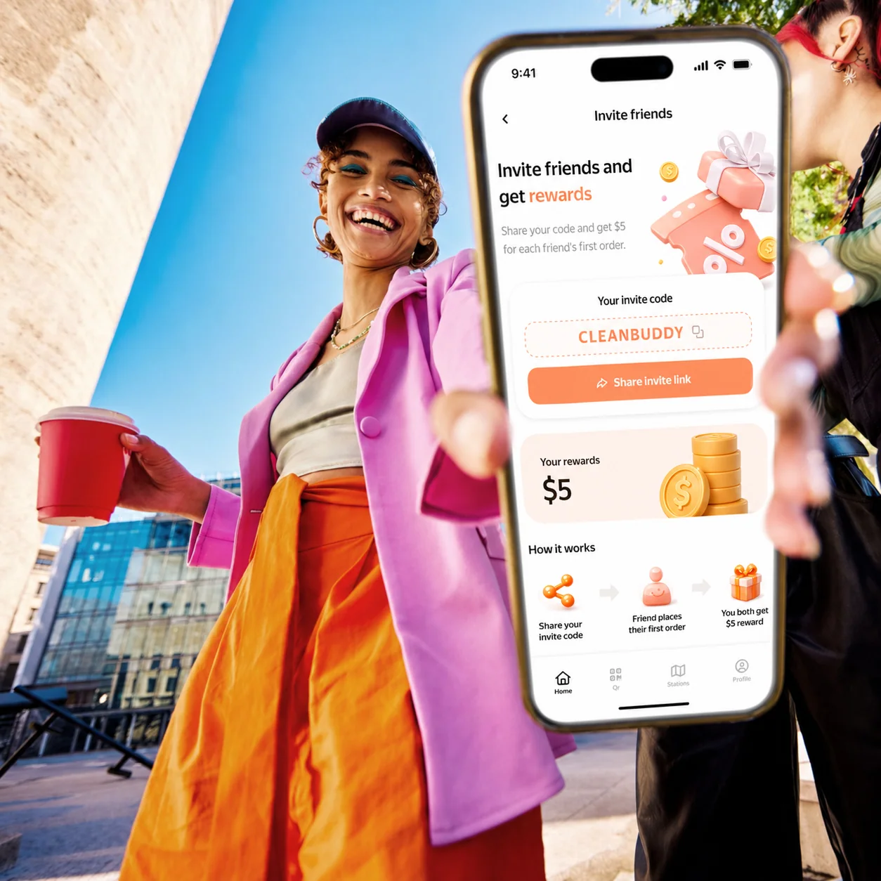
What changed
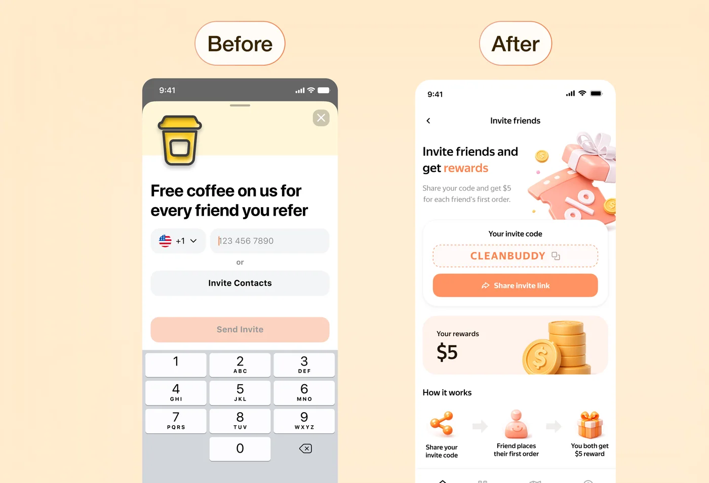
Before, the flow required effort without clearly showing the benefit. After the redesign, users immediately see what they get and how it works, making them more likely to invite others.
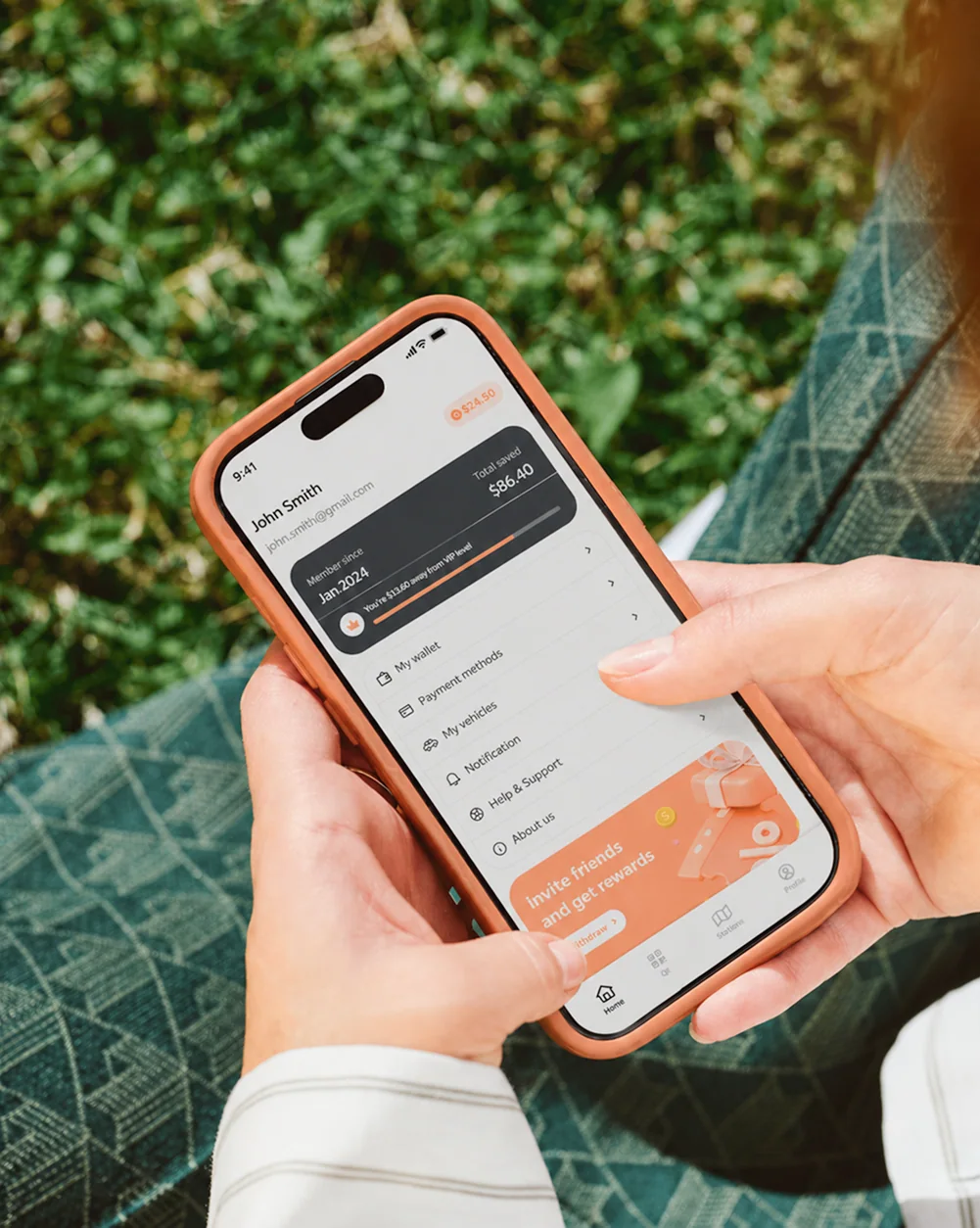
What changed
Before, the profile was mostly a settings list. After, it highlights user value and makes the screen more engaging.
After the redesign:
Retail investors often face overloaded interfaces, complex metrics, and unclear portfolio logic. This increases anxiety around financial decisions and reduces engagement.
Problem
Users struggle to understand:
The data is available, but it doesn't support decision-making.
Product Goal
Design a clear and manageable investment experience where users can:
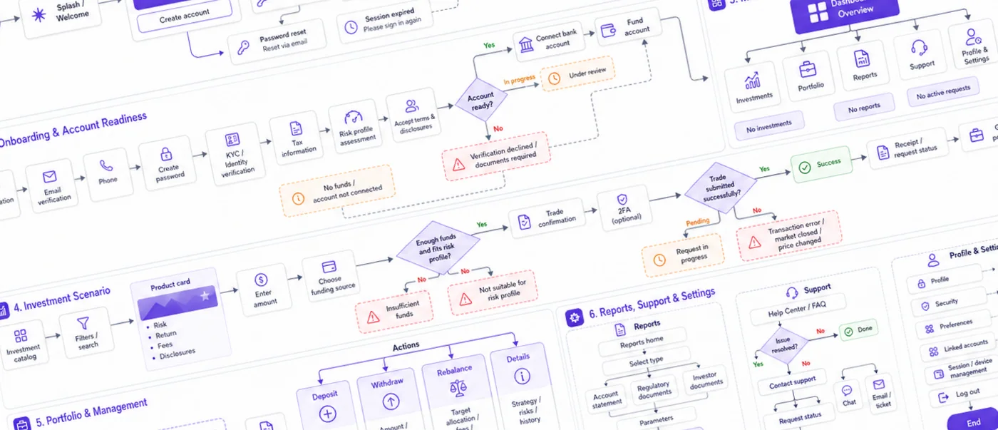
To respect NDA constraints, this flow has been anonymized and partially restructured; the UX approach and decision logic remain representative of the original work.
Approach
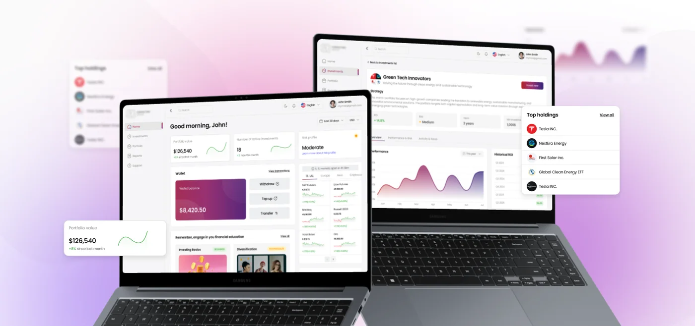
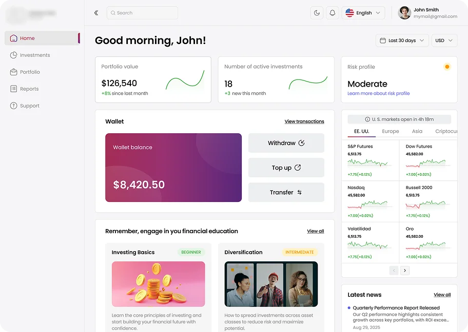
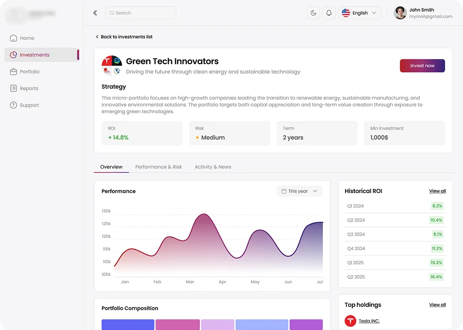
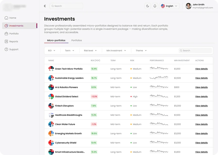
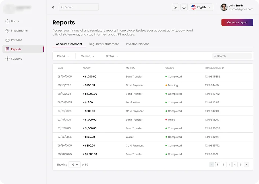
The design focused on shifting from data-heavy interfaces to decision-driven UX by reducing visual noise and prioritizing key metrics like portfolio value, risk, and activity. I introduced clear risk indicators, ROI dynamics, and actionable steps, turning passive data into guided decisions. Educational content and curated portfolios support learning within the product, while transparent portfolio details ensure clarity and user confidence.
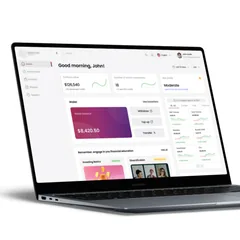
Main Dashboard
Investments Screen
Portfolio Details
Reports
Results
Takeaway
The key shift was moving from data-heavy interfaces to decision-driven design — helping users not just see information, but understand what to do next.
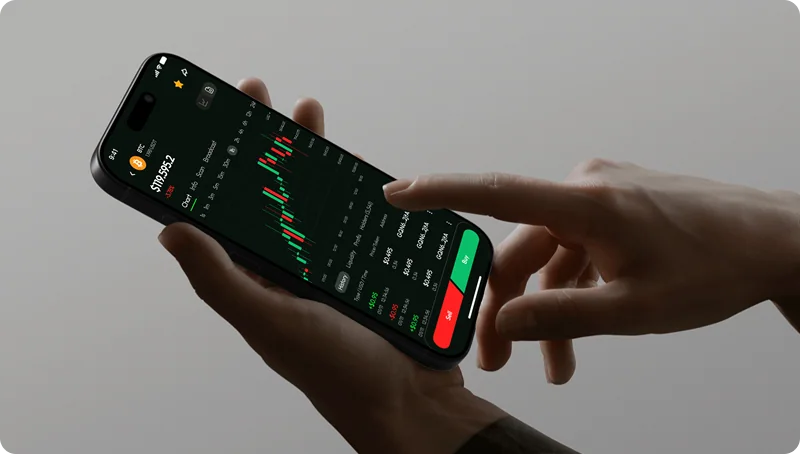
A mobile app for active crypto traders — combining wallet, market analytics, and trading in one product. The core challenge wasn't visual: it was structural. Three distinct mental models had to coexist without creating friction between them.
A mobile app for active crypto traders — combining wallet, market analytics, and trading in one product. The core challenge wasn't visual: it was structural. Three distinct mental models had to coexist without creating friction between them.
Active trading happens under time pressure. In the existing flow, a user checking their balance, spotting a movement, and executing a trade had to navigate across three disconnected sections — each with its own logic. Every context switch added cognitive overhead at exactly the moment it was most costly.
The key insight: the interface treated wallet, market, and trading as separate tools rather than stages of a single workflow.
Before opening Figma, I spent time understanding how active traders actually behave. I interviewed five users — a mix of day traders and occasional investors — and the pattern was consistent: everyone described the same moment of friction. You see a price move, you check your balance, you navigate to the asset, and by the time you get to the Buy button, the window might already be closing.
I also ran a competitive analysis across Binance, Coinbase, and Kraken — not to copy their patterns, but to understand where they force the same context-switching problem and where they don't. What became clear is that most trading apps are designed around features, not around the sequence of decisions a trader actually makes.
That reframe — from features to decision flow — became the foundation for the architecture.
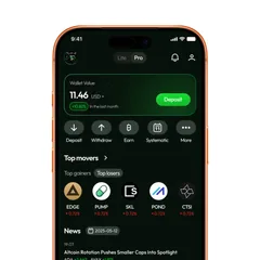
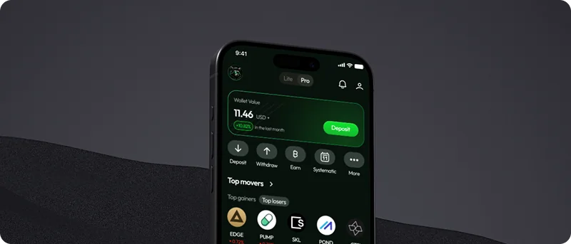
Home screen as situational awareness. Balance, top movers, and market news in a single scroll — so users can orient themselves without leaving the starting point.
Market screen starts with the macro picture. Dominance metrics and total capitalisation sit above the asset list, giving context before the user drills into a specific coin.
Asset view with persistent actions. Buy and Sell are always visible regardless of scroll position. On a volatile chart, making a trade button a scroll target is a UX liability.